These are the top four captures from my Color Project. All photos were edited in Lightroom, with watermarks added in Photoshop.
For this photo, I began by cross processing to get a general color scheme, but then changed the tonalities a fair amount to achieve the desired results. Since I am very much into early color photography from the 50's, I edited mine so it has the strange color shifts, saturation, and grain that the early color photos possessed.
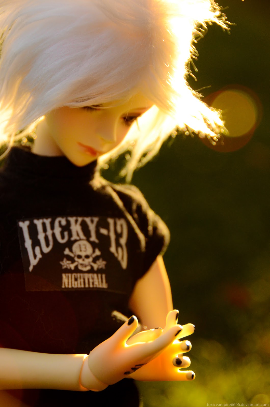
Like the previous photo, I began by cross processing it, then tweaked the saturation, hues, levels, and what-not until I liked it. I wanted to emulate early color film in this one as well, but particularly polaroids. I added a bit of a white vignette to create the faded effect that many developed along their edges.
This photo is from the "greys" portion of my project. It still possess a tinge of color, but focuses mostly on warm greys with a touch of cools.
As with the previous photo, this is from the "greys" portion of my project. It still possess a tinge of color, but focuses mostly on warm greys with a touch of cools in the background.